CNN and The New York Times – certainly two very big names in the news industry that know how to present themselves. To show you the capabilities of crowdtesting, we chose those two websites as UX testing subjects for our crowd. The reason? Because we truly believe that there is always room for improvement. Even when you are one of the biggest players in your market, you can always improve a should always strive to do better each and every day. At Testbirds, we believe that our crowd can help you do so. Let’s talk about how…
We asked around 500 testers from all around the globe to have a deeper look into the respective websites: cnn.com and nytimes.com. The results they provided were interesting as well as surprising. Below, we’ve split our analysis and want to start with a very common UX topic: Mobile vs. Desktop use.
Data & Statistics about Mobile Usage
Mobile first! How long has this been said? Mobile design and users are important and there is still a lot of room for improvement UX-wise, especially when we have a look at websites around the globe. But first, let’s have a look at some statistics that show desktop vs. mobile usage (as of 2018).
What percentage of web traffic is mobile?
The Mobile vs Desktop Usage Study of PerficientDigital states that 58% of site visits in 2018 came from mobile devices. Additionally, mobile devices made up 42% of the total time spent online. Looking at those statistics from a UX perspective, it’s important to consider that people spend less time on a site when using a mobile device. The average mobile user spent 5.95 minutes per visit, whereas desktop users spent an average of 11.52 minutes. Another difference between mobile and desktop users is that mobile users visit fewer sites than users on a desktop device. And whereas the average mobile user views 5.15 pages per visit, the average desktop-user views 9.84. These are all important statistics to consider when designing your mobile website.
Mobile Users vs. Desktop Users in the News and Media Industry
Speaking of CNN and The New York Times, let’s have a look at the numbers for the news and media Industry, keeping them in mind for our later analysis of their sites. At 51%, the percentage of mobile web usage is even higher compared to other industries. Mobile users on these sites are quicker; they only spent on average 3.33 minutes on the site and viewed 3.05 sites.
What about video views and search?
TechJury collected 52 Mobile vs. Desktop Usage Statistics for 2019 that help us to understand how users watch videos and perform searches on mobile and desktop devices.
Let’s start with the fact that more than half of all video views come from smartphone users. According to Google, 58% of all searches happen on mobile devices. Furthermore, nearly 4 out of 10 people searched on Google with only their smartphone.
In summary, we can say that mobile is a big player when it comes to website visits, time spent on sites, video views, and search. This news shouldn’t come as a surprise, but something to consider before discussing the UX battle.
UX Battle: What our Crowd says about CNN and NYT
In this UX battle, our Crowd dug deeper into the mobile and desktop websites of CNN and The New York Times (cnn.com and nytimes.com, respectively), focusing especially on the front page, video section, and the search functionality. Below, we’ll discuss the results.
Front Page & Layout
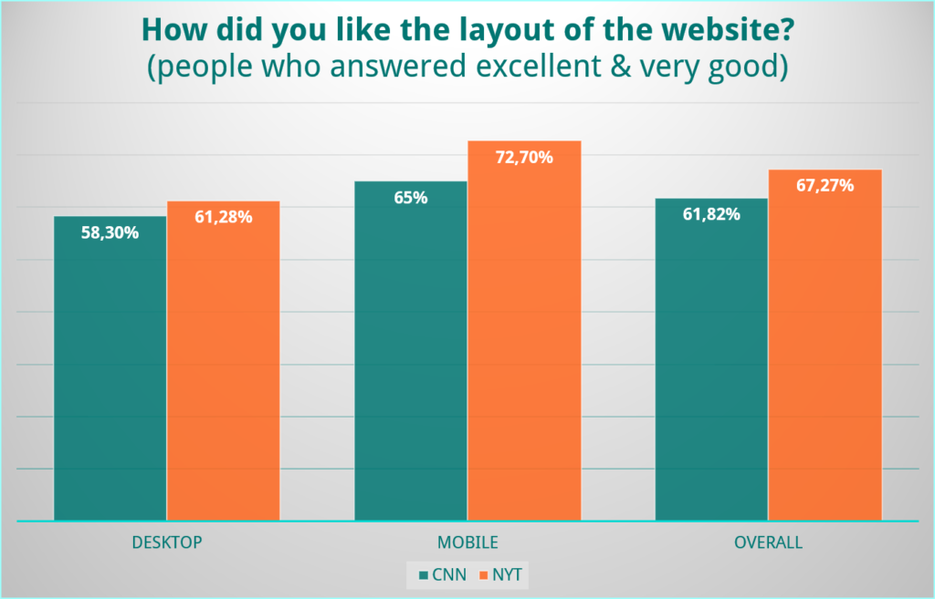
The first thing you notice when entering a website is the overall layout. In general, whether you like the look of a site or not is more a feeling rather than something you can explain with detailed reasons. We were surprised to observe that the user experience on the mobile versions of CNN and The New York Times was more liked than the one on the desktop version.
At the very beginning of the user journey, we want to concentrate on the entrance point for most users: the front page. We can all agree that the front page especially of a news website should be clear and well-organized. While the mobile and desktop versions of the CNN site was rated as “clear” or “rather clear” by around 66% of our participants, there was quite a big difference between the mobile and desktop versions of The New York Times site with regards to clarity.
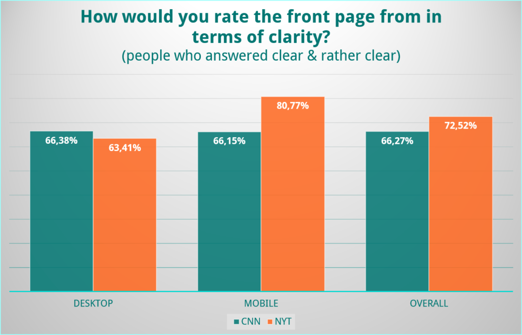
Users enjoyed the mobile version of NYT a lot more than the desktop view. Let’s have a closer look at the differences between the two sites:

The desktop version of NYT is cluttered with different things: headlines, pictures, stories, bullet points, and so on all arranged in quite an unstructured way. It’s hard to digest all the information and to recognize which headline belongs to which story or image. However, on the mobile version, we get a completely different Images, headlines, and bullet points – in other words, the “normal” layout of an article preview. The design is only interrupted by a sprinkling of headline-only article teasers. All in all, we can say that the mobile version seems to be cleaner and more structured than the desktop version, users seemed to like it as well.
Looking at CNN, we can see that the desktop version seems much more structured, all while showing less information. While The New York Times site tries to add a short introduction to the stories under the headlines, CNN mostly just gives headlines without further explanations. This leads to a similarity between the mobile and desktop versions of the site. However, it should be noted that test participants liked the preview offered by the NYT site.
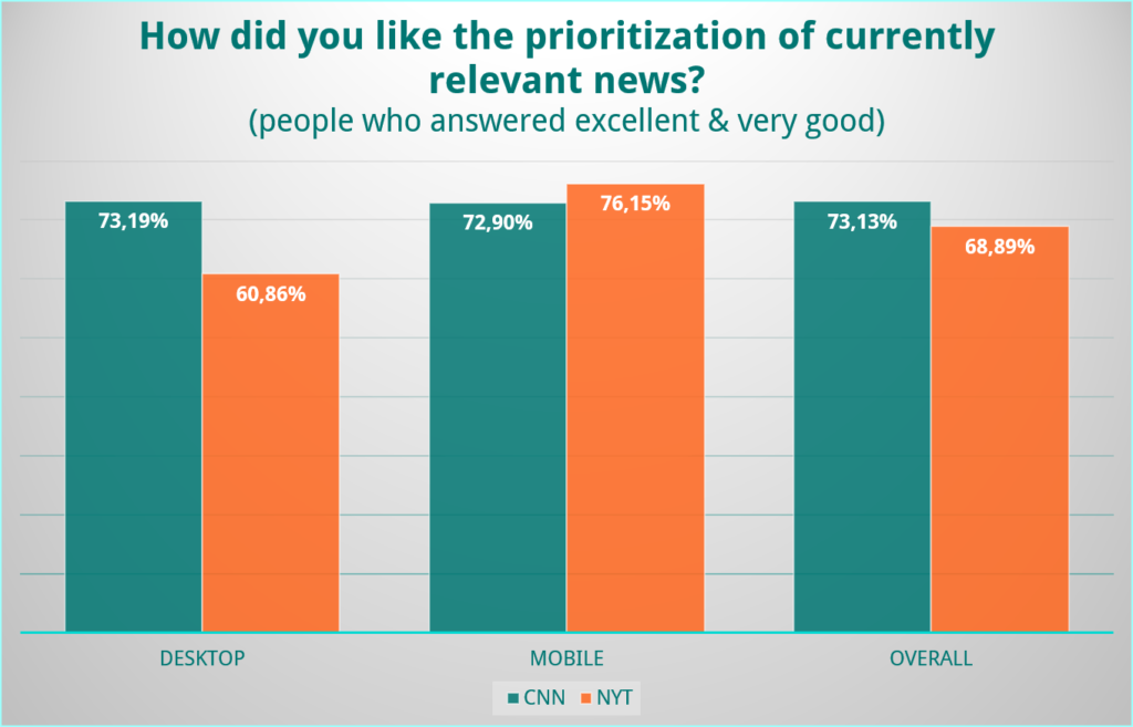
We can’t discuss a news website without mentioning how breaking news is displayed and prioritized. Let’s have a quick look at the prioritization of breaking news on each site. On CNN, the results from mobile and desktop users were quite similar, as demonstrated in the chart below. However, on the NYT site, there seems to be a large gap between what desktop and mobile users see.
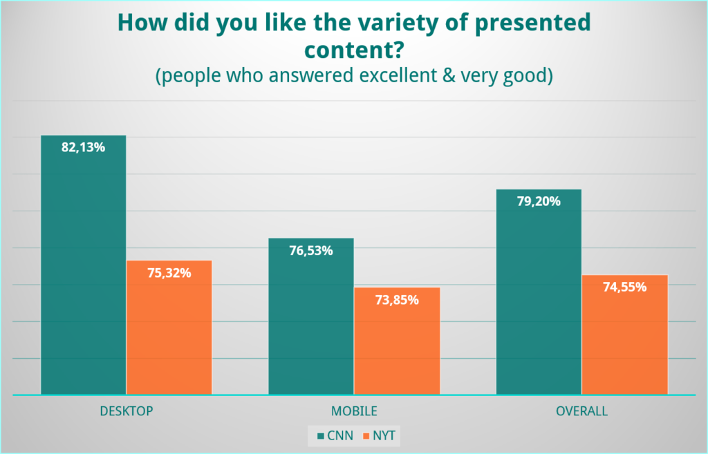
After topicality, the variety of content is an important aspect for news sites. One might assume that the desktop version is always rated better than the mobile view due simply to the fact that there is a lot more space for content on a desktop device. While this is especially true for CNN, the gap between mobile and desktop is surprisingly quite small for the NYT.
So, who wins the first round of our UX Battle? The point for front page and layout goes to… The New York Times! The good mobile site performance in particular helped push them over the top.
Video Section
Video SectionVideo becomes more and more important when we talk about how users are consuming the news they receive. That’s why the next part of our UX Battle deals with the video content of CNN and The New York Times sites. We first wanted to know how users rated the video section in terms of visibility on the front page.
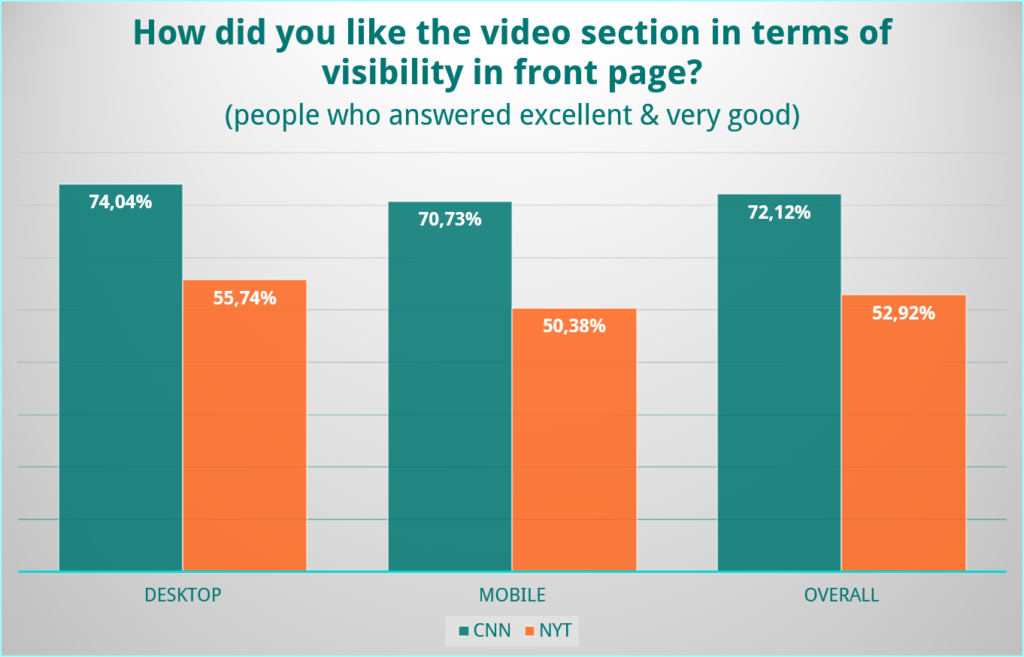
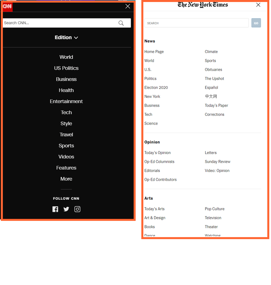
Looking at the results, it becomes quite clear that NYT has a lot of room for when it comes to visibility. Although both websites have “video” as an own category in their menu, it seems that videos are a lot easier to find on CNN. We get an explanation for this looking at the menu on mobile devices. CNN’s videos are a lot easier to find because The New York Times hides the video section at the very end of the menu.
Another reason why this might be is that the NYT does not include any videos in their article previews on the front page, while CNN does.
It’s a shame that the video section of the NYT site is so hard to find, especially when we consider the findings from the next few questions that addressed the quality of the video sections.
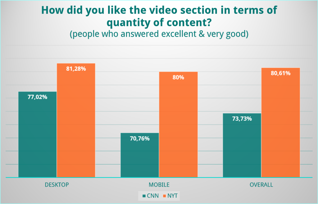
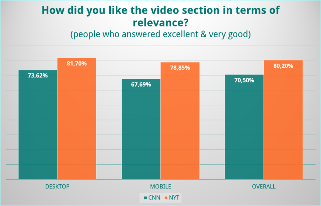
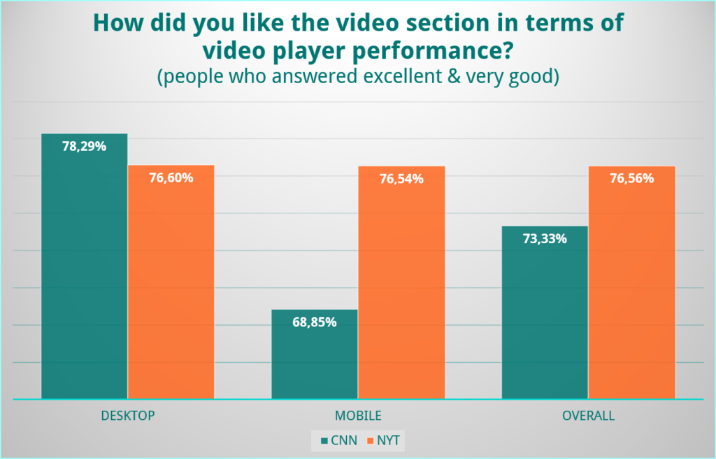
In terms of quantity, relevance, and player performance of video content, the NYT sites succeeds. This is especially due to the fact that the video player performs so well on both the desktop and mobile versions of the site.For CNN, things look different. While the desktop version seems to function seamlessly as well, the mobile version didn’t convince our testers. This makes the NYT site a winner again!
Search
Are you ready for the third and final round of our UX Battle – Mobile vs. Desktop? This section is all about searching and finding a specific article on the desktop and mobile versions.
What’s the most important thing about search? That you find what you’re looking for! The good news is that almost 80% of our testers found the articles we asked them to look for on both pages.
How easy was it for users to find them? Looking at the results, searching for articles on the NYT was quite easy on both the desktop and mobile sites. Searching on CNN was easier on a desktop than on their mobile device.
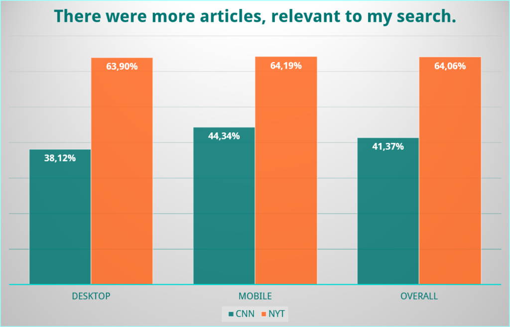
Another important aspect of search is how many relevant articles are displayed in the search query. According to our testers, there’s a big difference here between the NYT and CNN. Whereas over 60% said that there were more articles relevant than irrelevant to their search on the NYT site, the percentage drops to 44% on the mobile version of CNN and only 38% if we have a look at the desktop version.
For the third and final round of our UX Battle, the points again go to The New York Times.
Overall
After we had a deeper look into the front page and the video section and search functionalities of both sites, let’s compare the overall design on web browser, tablet and mobile.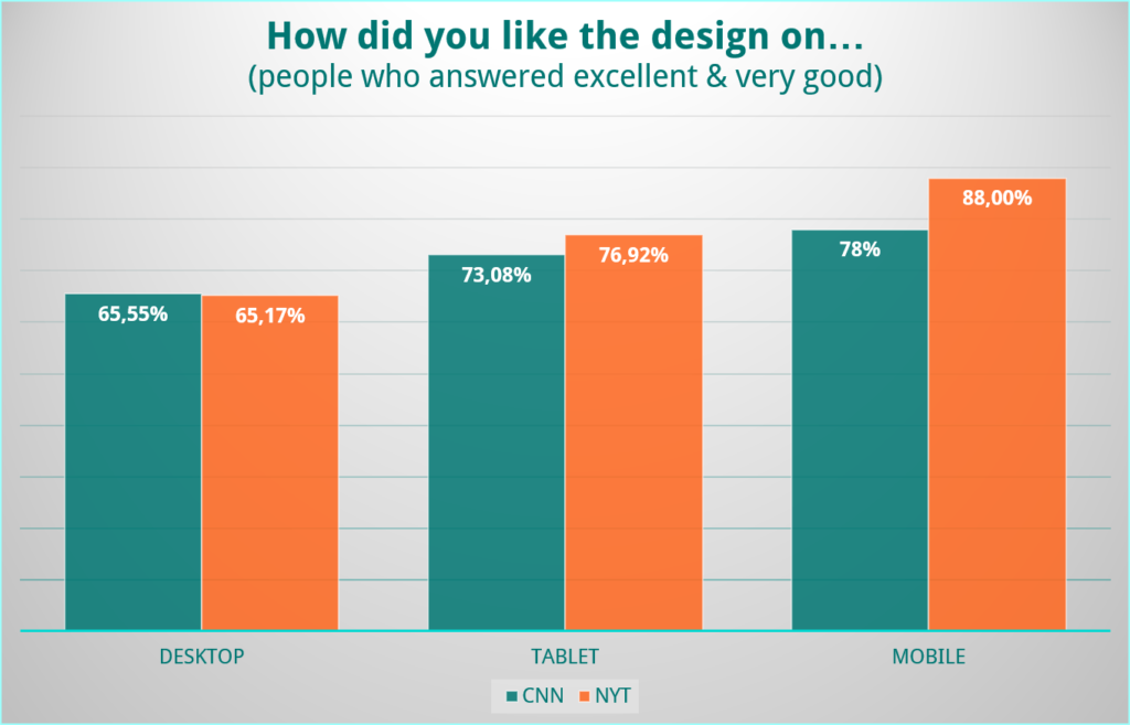
The results for the web browser are very close and therefore can’t identify big differences between CNN and the NYT. Looking at the performance of both sites on a tablet, one can notice some minor differences.
We can observe the biggest contrasts when we have a look at the results from testers using a mobile device. While the results for both websites are still very good, the NYT is rated better than CNN.
Our Conclusion and Possible Advice
While both the CNN and The New York Times sites are rated highly, there is always room for improvement. Comparing the mobile and the desktop version of The New York Times we see that users rate the mobile version higher. In a comparison study, the NYT could try to understand the reasons for this rating and how they can structure their desktop version even better.
CNN could do a competitor analysis to get deeper insights into what testers liked about the NYT site and then try to improve their own website based on this feedback.
In their video section, the NYT should try and understand where users would expect this section to be located and how important it is rated. Especially on mobile devices, they should try to increase its visibility, as users rated the quality of the videos quite high once they found them.
In terms of searching, CNN should try and understand why it was easier for users to find articles on the desktop site. A possible question that applies to both versions of the site: Is it better to show more but perhaps irrelevant articles in the search results, or would it be better to show fewer but more relevant articles?
Not sure how both companies would go about doing so? Well, we have a few ideas! Why not try a Usability and UX Study, Remote Interviews, or Remote Usability Videos to truly understand what your users see and think and how they behave when visiting your website. Testbirds can help you with that! Our crowd consists of over 400,000 testers from all around the world and you can select your exact target group with the help of 65 demographic criteria.
If you want to learn even more about the ways our crowd can help you test your website, let’s talk in person. We are going to be at the DMEXCO 2019 on 11th and 12th of September in Cologne. Click the button below to get in touch and book a meeting with us at our booth.