Typography is one of the most important and one of the most neglected aspects of written communication. When we read a text we rarely reflect on what the text actually looks like – unless something is wrong. The importance of typography carries over into the realm of UX: you might have a logical flow in your user interface, dazzling icons and pictures, and the most vibrant colours, but if your typography isn’t on point then you’re going to have a problem.
You’ve probably heard the term typography before and when asked what it is, many people say, “it’s like fonts and stuff” – which is sort of correct. Typography is the craft of arranging text, customarily known as type, in a way that is visually pleasing and easily read (generally speaking). The subject is broad: stretching from the design of a typeface and all its intricate details, to formatting text in a book or newspaper, or to the artistic expression of experimental typography (which is usually not easily read).
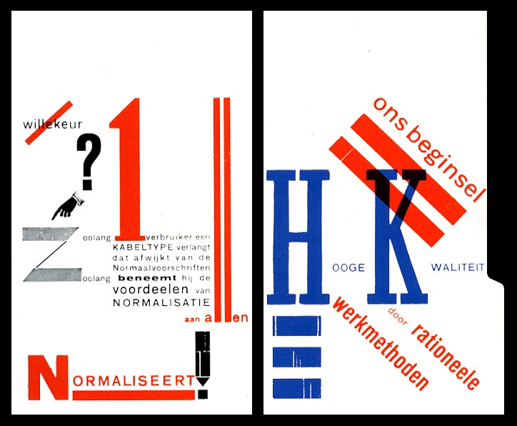
Experimental typography is not the best choice for UX. Source: Carnegie Mellon University
Choosing the right typeface
There are many factors that affect how we process the somewhat arbitrary lines that humans chose to represent the different sounds of our languages. These factors influence two main aspects of typography – legibility and readability. Legibility is how easy it is to tell different characters apart and mostly concerns characteristics in the design of that specific typeface or font. Readability is how easy it is to read a text, which is affected by which font is chosen, the size of the type, line spacing, and line length, among others.
As with the rest of your UX design, you should keep your end-user in mind when working with typographic UX. When choosing typefaces or fonts, spend a little time thinking about what your user experience and your brand represents and try to reflect this in your typography. Take a look into the history of the typeface – why it was created, how it’s been used previously (and by who), what sort of influences does it have, etc. Also, consider what feelings the design of the typeface is provoking and if this is the correct representation for your user experience.
Right now you might be wondering, “What’s a typeface and how is it different from a font?” A typeface is also known as a font family meaning that one typeface is made up of several different fonts with different weights, styles, widths, and so on. Most typefaces or font families are made up of a regular, bold, and italic font but many typefaces have additional fonts with other variations in characteristics.
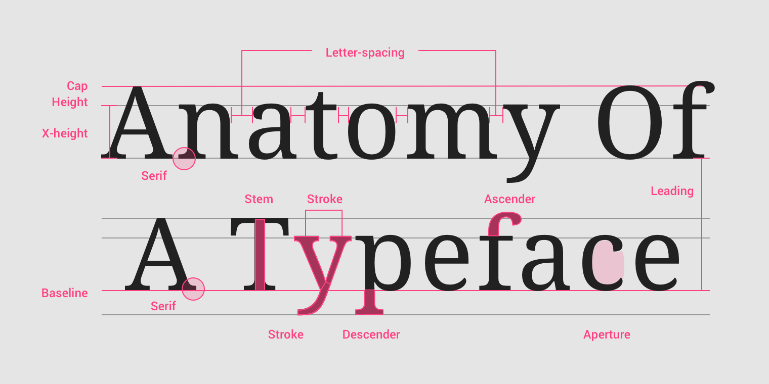
These are just a handful of the many detailed characteristics of a typeface. Source: Material Design
You chose the wrong typeface
So you’ve chosen a typeface – now what? If you’re designing for the Web you’re going to need a fallback, or preferably several. You went through all this trouble picking the perfect typeface but unfortunately, your perfect choice might not be supported by the user’s browser. In this case, you still want your users to be able to read the text – a fallback is the typeface that the browser will revert to if your primary choice isn’t supported. It might not look as good, but it does keep your website accessible.
Another aspect of choosing a typeface concerns the combination of several typefaces or fonts – most recommendations will say to not combine more than two typefaces. Too many typefaces used together result in a chaotic, jumbled typography, which will also be the feeling your users experience and associate with your brand. With your two typefaces, the usage scenarios will be slightly different – one might be for headings and the other for body text. They will be seen together, however, so they should complement each other – not too similar, not too different.
If it ain’t broke, don’t fix it
Fonts can be endlessly tinkered with, but they’ve already been meticulously designed down to the last detail so you shouldn’t be making changes without good reason. You might want to fit a text into a designated space but designers often suggest changing the copy (the words you’ve chosen and how you’ve written your text) before making typographic adjustments.
For an optimal user experience, there are a few changes you can consider that won’t be messing with the details of the font. The line length of your text should be optimised for the screen size that it will be displayed on – if lines are too short the reader will have trouble maintaining rhythm in their reading, if lines are too long the reader will have trouble focusing and finding the next line. Readability will also improve if the line spacing is high enough for the reader to easily distinguish between lines, and find the consecutive line of text.
ALTHOUGH THIS PARTICULAR TEXT RIGHT HERE IS VERY IMPORTANT, you should avoid using all capital letters in your text as they are more difficult to read, and easily distracting. Also, I wouldn’t recommend yelling at your users.
Designing a typeface that is coherent across different alphabets is not an easy task. Source: Monotype
A custom typeface for a custom experience
Certain companies commission typefaces to be created exclusively for them, to embody company values and provide an optimal experience for their specific users. Apple developed the San Francisco typeface in different variants for use across their product line. Newspapers, like Süddeutsche Zeitung, use typefaces specifically designed to be legible on digital screens, adapting to the increased demand for digital publications as well as to strengthen their brands. Tencent, a Chinese company working with Internet-related services, started using their custom typeface which was developed to strengthen their brand identity across several markets. The challenge here was combining the typical forms and shapes of different alphabets into one coherent typeface that works just as well for Latin characters as it does for Chinese, Japanese, Greek, or Cyrillic characters. MIT developed Sans Forgetica, a typeface that makes it easier to remember what you’ve read by deliberately being difficult to read (but not too difficult).
You probably aren’t in the market for a specially commissioned typeface – if you are, congratulations, typefaces are expensive! The point I’m making, though, is that your typographic UX design will undoubtedly have an effect on how you are perceived by your users and customers, so don’t neglect typography in your user experience.
Need help finding your type?
If you’re looking to optimise your user experience, Testbirds provides testing for usability and UX. We can help you assess the typography of your digital products, as well as many other UX aspects.